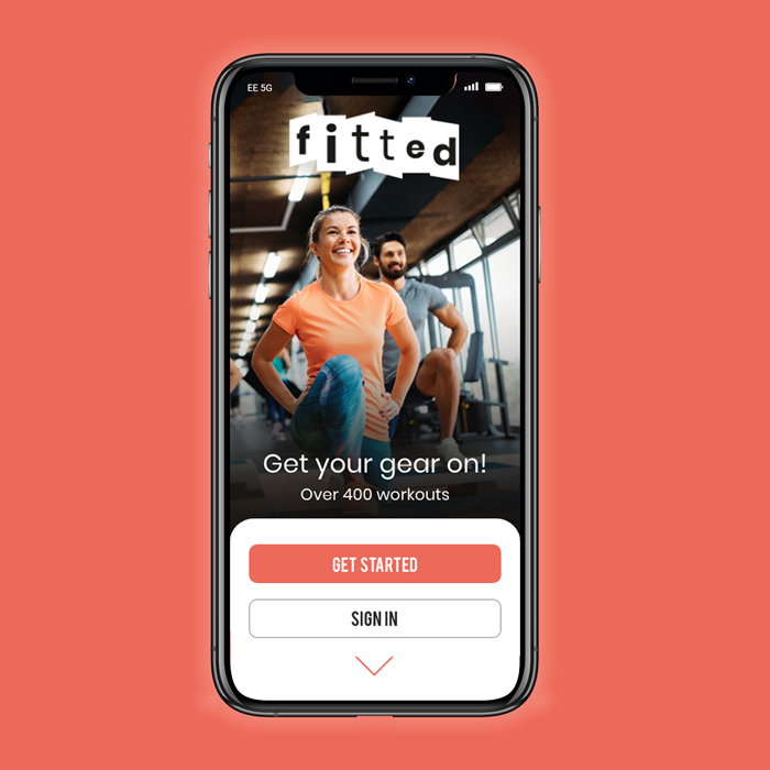
Fitted is a web app designed as a motivational tool for workouts that can be performed anywhere

My role:
UX/UI Designer
Timeline:
May – June 2021
Methodology:
- User Stories & Personas
- User Flows
- Low-Mid Fidelity Mockups
- Wireframing
- Mobile Breakpoints
- High Fidelity Mockips
Tools used:
- Adobe XD
Overview
For those who are new to exercise or returning after a break, it can be challenging to establish a consistent fitness routine. It’s important to have a plan and easy access to workouts to help people stay motivated.
Key points:
- This app focuses on people who are new to fitness or returning after a break
- Finding exercise routines suited to your level can be difficult, especially if you want to try something new
- Finding time to exercise can be challenging when trying to fit it into a busy lifestyle
The Problem
People have been working from home during these challenging times with COVID-19, which has introduced additional responsibilities such as taking care of their children. Although people may save time by not commuting to and from work, caring for their loved ones can result in less time for themselves.
My challenge is to build an app that fits around the user’s schedule, not the other way around. While finding time to exercise can be difficult, I will aim to create a flexible approach in this project.
The Solution
I will design an app that allows users to select exercises based on their fitness level. The app will feature videos that demonstrate proper form during each exercise. I will also integrate an activity calendar, enabling users to choose when to perform their workouts at times that are convenient for them.
The Process

Persona
The course project brief provided this persona.

User Flow
Having gained a better understanding of the persona, I mapped out a user journey using a user flow. I selected one of the user stories provided in the project brief as a starting point.
As a new user, I want to be able to search for an exercise, so that I can save it and do it in my own time.

Prototypes
I put pen to paper to sketch out low-fidelity wireframes. This was an efficient way to capture ideas quickly and create a foundation to build upon.


Mid-fidelty Prototype
The next step was to refine the low-fidelity wireframes into a mid-fidelity prototype. I used a six-column grid structure to help define Fitted’s content hierarchy and ensure consistency and alignment across all devices.
-
Screen size: 360 x 760px
-
Columns: 6
-
Gutters Width: 8
-
Columns Width: 42
-
Margins: T,64, R,24, B,64, L,24

As soon as I built the prototype, I linked the screens together to test the interactions with some users. I received some initial feedback and was able to identify any pain points encountered by my users.
As soon as I built the prototype, I linked the screens together to test the interactions with users. I gathered initial feedback and was able to identify key pain points they encountered.
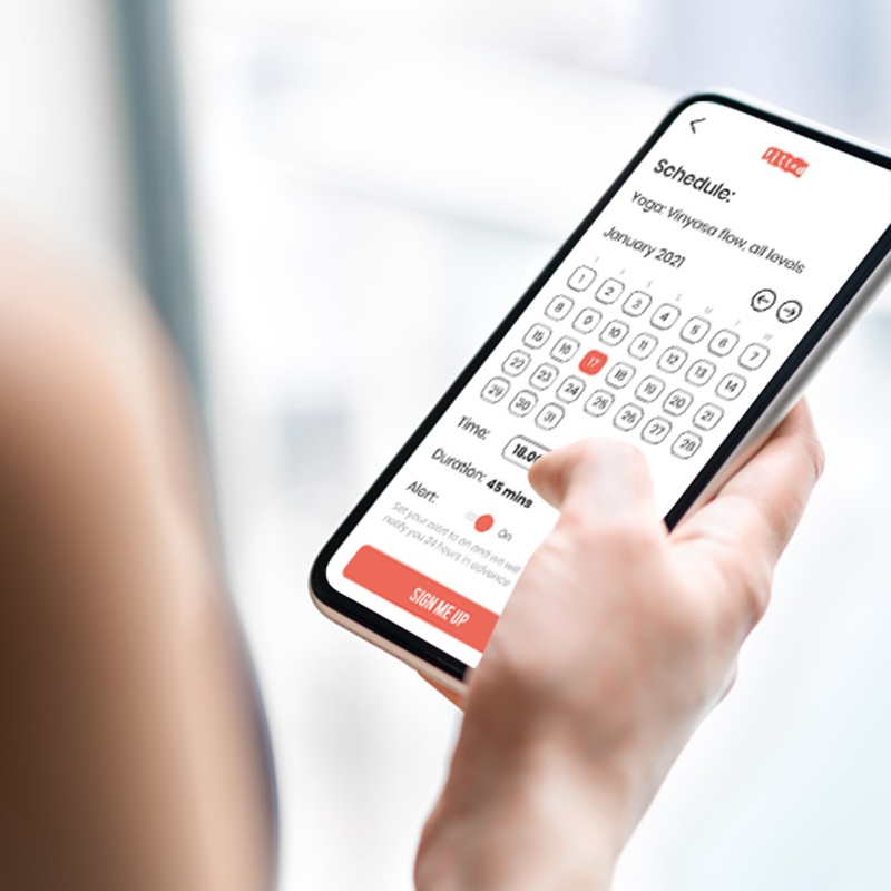
The following flow shows how Rebecca would sign into the app and schedule an exercise:
- Sign in
- Search for an exercise
- Apply filters to narrow the search
- Schedule the exercise for a later date


Moodboard
Two mood boards were created to convey different design directions. I chose the board on the left, as it best sets the tone for my app. Orange was selected as the primary colour, representing playfulness, warmth and energy. To achieve a modern look and feel, the typography is bold yet minimal.
Branding & Visual Design
Referring back to the project brief, the next step was to define the app’s visual details and develop its brand design.
Brand purpose
Fitted is an app that helps people create an exercise routine tailored to their fitness level, schedule and interests, making it an integral part of their lifestyle.
Core values
- Simple: easy to use and understand
- Fun: provides a pleasurable experience that keeps users engaged
- Motivational: encourages users to progress to the next level
- Flexible: seamlessly integrates into the user’s lifestyle
Logo
The brand logo was designed to function in three different states.
Colour Palette
Defining the color palette is an essential part of the design and choosing the right combination is crucial. I applied the 60–30–10% rule when using colors in my designs to maintain consistency throughout the app.

White
#FFFFFF
R:255, G:255, B:255

Grey
#2A2B2A
R:42, G:43, B:42

Coral
#ED6A5A
R:237, G:106, B:90

Electric
#058ED9
R:5, G:142, B:217

Fog
#EEEDED
R:241, G:242, B:246
Typography
With all other design elements in place, choosing a suitable typeface is just as important. I wanted a font that was simple to read and easy on the eyes. To remain competitive, I aligned my app’s typography with that of other fitness apps on the market.

To explore the visual style guide, use the left and right arrows below.
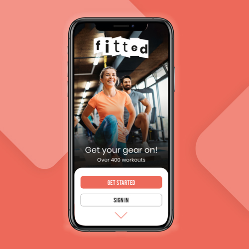
High-Fidelity mockups
The final part of this project was to create high-fidelity mockups of the app’s screens. Here are some visuals that apply the design principles and concepts discussed above.


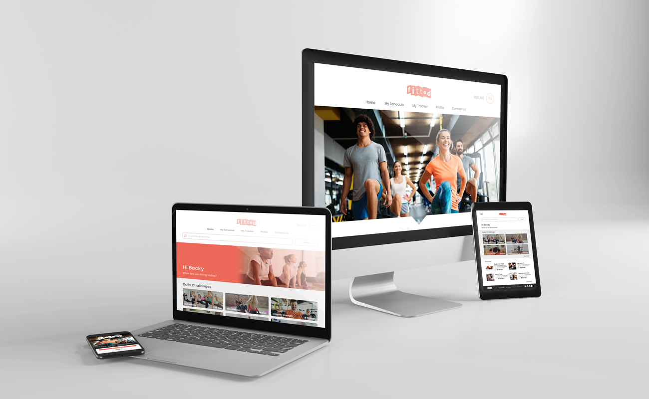
Responsive design

I reviewed the different breakpoints for my web app. In addition to accessing the app on mobile devices while on the go, users may want to use it on a variety of devices, such as desktop computers at work, to track their progress.

I created both low-fidelity and mid-fidelity wireframes before developing high-fidelity mockups. These mockups demonstrate the app’s responsive breakpoints for Mobile (360px), Tablet (768px), and Desktop (1280px).
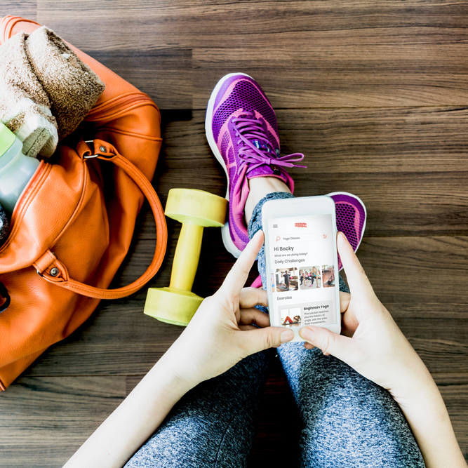
High-Fidelity Prototype
The final part of the course involved creating a high-fidelity prototype to demonstrate how Rebecca would use the app. I tested the prototype with my course mentor and friends, receiving positive feedback.
Learning & future development
In 8 weeks, I completed the UX/UI project and gained a solid learning experience. Once I developed the initial flow, I was eager to continue refining it. With more time and the insightful guidance from my mentor, there would have been opportunities to add more functionality and create additional visuals.
On reflection
- Time: The timeframe was a bit short and I would have liked to incorporate more functions into the app. Fitted has the potential to become an integral part of people’s lives, helping them perform exercises at home, especially during COVID-19. I would have liked to explore a gamification aspect that rewards Rebecca and motivates her to progress further
- User testing: I conducted a few user tests and received valuable feedback. Testing with friends and family can be tricky, as they are not professional testers. I had to clearly explain each component so they understood the aim of the tests. For a real project, I would consider paying professional testers from UX testing platforms to get more reliable results
- Colour palette: I would have liked to experiment with a different set of colors to create a different mood for the app. Since Fitted focuses on workouts at home and outdoors, incorporating earthy tones could have enhanced the design. I ultimately went with the orange theme, as specified in the project brief